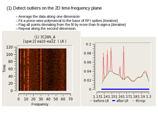
TFCrop :
The plot on the left shows the time-freq plane for one baseline (and timerange chosen by the user).
The plot on the right shows the same data, averaged across time (in red), and the piece-wise polynomial fit across the base of RFI spikes (in green).
(ignore the blue line at the bottom).